The CSS3 text-oveflow property allows to have content not exceed a certain limit. Browsers can be asked to place ellipsis, the … “character”, after the last visible character rather than just cutting content off. It’s a nice visual indication for readers that there’s actually more content than what is shown. Later you’ll learn techniques how to use ellipsis in fixed-width or max-width table columns using HTML and CSS.
Before text-overflow supported ellipsis in most browsers (i.e. before maybe 2011) your only option was to use complicated font-metrics calculations on the server, cut-off the content after a certain number of characters, and append … manually. The results were obviously dissatisfying because one could never get this quite right across all browsers. Besides, since you don’t have control over the font-sizes in browsers it always remained a poor approach.
General remarks
The CSS instruction text-overflow: ellipsis can be used in various places but it always has to be applied to the HTML container that hosts your content. The container is for example a <div> or a paragraph – or a table cell. Also, it should be accompanied by the overflow: hidden CSS instruction. This is an indication to the browser that under no circumstances you want “excessive” content to be displayed.
Ellipsis in table columns
Consider the following requirements
- you have tabular content in two columns
- both columns combined must use at most N pixels
- the right column has a fixed with of n pixels
- the left column should use as few pixels as possible (at most N – n obviously)
- and if the content in the left column exceeds the available space it should be cut off using ellipsis
The code
Based on discussion on Stackoverflow here are three techniques:
- use an HTML table
- use div with
display: inline-block - use floating div in div
<!DOCTYPE html>
<html>
<body style="font-family: sans-serif; font-size: 15px; background-color: #CCBBAA;">
<table>
<tr>
<td style="max-width: 307px;
overflow: hidden;
text-overflow: ellipsis;
white-space: nowrap;
display: block;
font-weight: bold;">
Lorem ipsum dolor sit amet, consectetur adipisicing elit, sed do</td>
<td style="width: 130px; color: #545556;">ST.2012.10.17.006</td>
</tr>
</table>
<div>
<div style="overflow: hidden;
text-overflow: ellipsis;
white-space: nowrap;
display: inline-block;
max-width: 307px;
font-weight: bold;">
Lorem ipsum dolor sit amet, consectetur adipisicing elit, sed do
</div>
<div style="width: 130px; color: #545556; display: inline-block; overflow:hidden;">
ST.2012.10.17.006
</div>
</div>
<div>
<div style="float: left;
overflow: hidden;
text-overflow: ellipsis;
white-space: nowrap;
max-width: 307px;
font-weight: bold;">
Lorem ipsum dolor sit amet, consectetur adipisicing elit, sed do
</div>
<div style="float:left; width: 130px; color: #545556;">
ST.2012.10.17.006
</div>
</div>
</body>
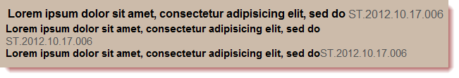
</html>Results in different browsers
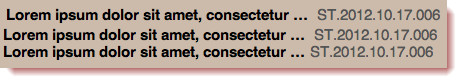
Safari on OS X
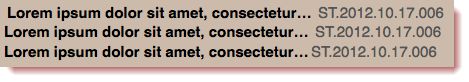
Firefox on OS X
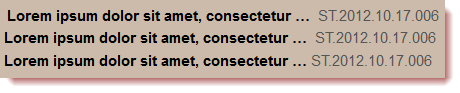
Firefox on Windows 7
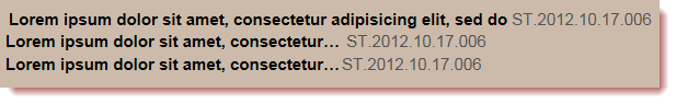
IE 9 on Windows 7
IE9 in quirks mode in Window 7
Conclusion
Contact me if you have an idea how to make this work for IE9 in quirks mode ;-). For all other browsers I favor the second approach over the third. I only use CSS float if there’s no other option because with every float you need a clear, too.